Discover Textilium
An insider guide to composing schemes at the Textilium Project.
So, what is the process in creating our compositions? Many years of experience have trained our eye to have opinions about what looks fresh and interesting and what doesn’t. There is certainly an amount of subjectivity involved and no set formula to realizing fabric schemes, but we do think about specifics that fit into our design philosophy and aesthetics. And the real fun is coming up with something by accident that inspires.
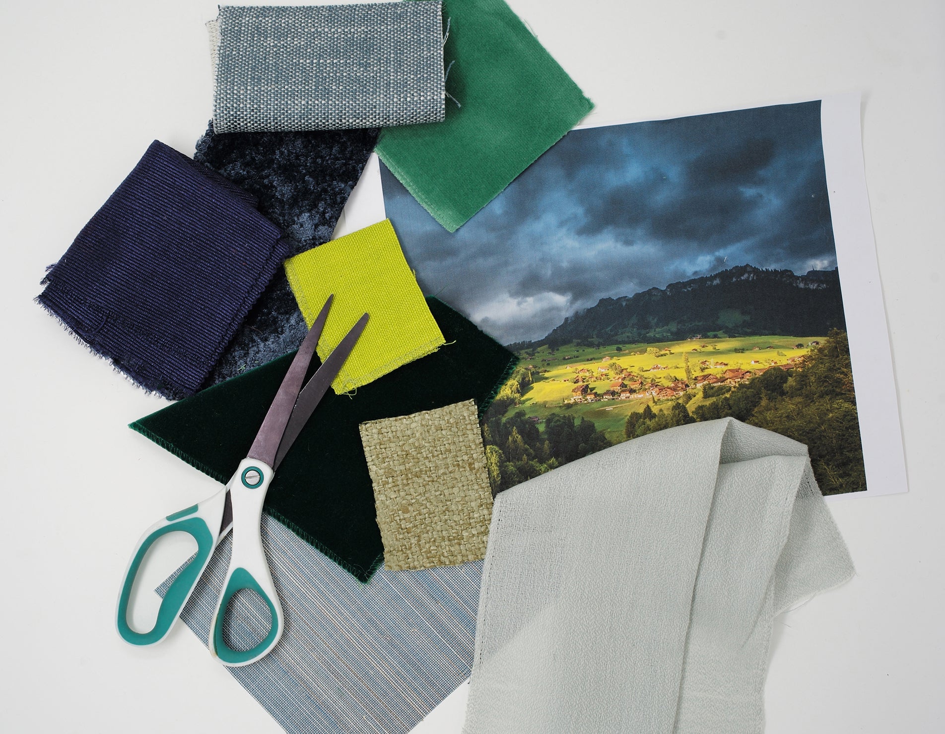
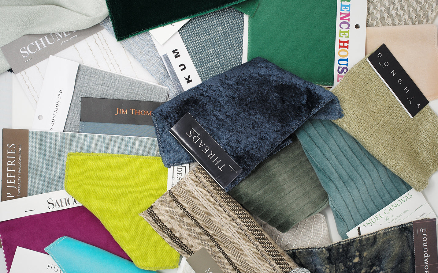
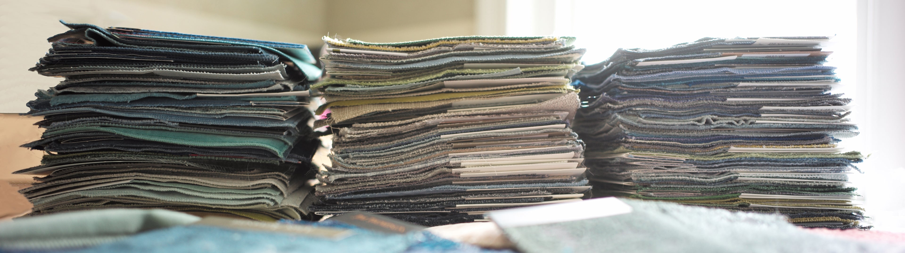
For The Textilium Project we select 8 different textiles, chosen from hundreds of thousands, to create a unique room scheme harmonizing diverse visual parts. Literally there are millions of possible combinations. They include window treatments, wall coverings and seating. Each component of the composition is evaluated for scale in the room and visual balance within the scheme.
-
Color context
Colors are affected by surrounding colors. Contrasting colors paired together can cause hues to appear completely different than when view singularly. This is called color context. To complicate the process more, many fabrics change in color depending on the lighting conditions. Multiple colors in a composition can make for infinite and complex possibilities.
-
Saturation
We include hi-saturation textiles in all of our schemes. Certain fibers such as linen and silk absorb dye in a way that they can appear quite vivid. Variations of this can add exotic and ethereal notes to a room. Even in a monochromatic scheme including a touch of saturation can accentuate the subtleties of the other materials.
-
Color blocking
All of the textiles we select for a scheme vary in color and texture. We want each of the 8 textiles to stand out on their own while offerring an interesting visual dialog to the overall composition. We think of a room scheme as an abstract artist’s canvas in that our eye is drawn to occasional surprises and offbeat notes upon further examination. Some of our schemes are quiet and subtle, but even in these each textile has visual definition and separation when compared to the others. Color blocking helps a room feel spontaneous and collected rather than matched or contrived.
-
Texture contrasts
Different weaves and surfacing of textiles change the way light is absorbed which effects color and visual richness. Varying textures, weaves and finishes in a scheme adds to the depth of a
composition. The texture for instance of cut velvet combined with a humble woven linen can bring out the beauty in each by emphasizing the differences. Combinations of shiny with matte finishes or raw with refined weaves are other ways to accentuate schemes with texture. We always include fabrics that have a handwoven feel. This adds to the organic aesthetic we love. -
Cues from nature
All examples of color, texture and the infinite ways to combine them in interiors exist in nature. We compare obvious and more subtle relationships of global photography to textiles to build our combinations. A room scheme is abstract until it is paired with a spectacular scene of nature then it becomes familiar and personal. Your connections to places you've been to or dream of visiting are a natural way to celebrate the design of your space. A remembrance of the outside world becomes your cherished inside world.
-
Personal taste
Creating unexpected combinations of color and texture is the art of great design. Room schemes that inspire us never look composed, they are inviting, enveloping and highly personalized. We favor long-lasting design that isn’t trendy but feels fresh. Finding the beauty in things that aren’t obvious to others and reinterpreting them in a special way is the essence of great taste. This is what we hope to help you do with your home.
More to Discover
Previously only for the few, the world’s finest...
Do you have a knack for style and covet the rooms in top shelter magazines? You’d love to furnish your own space, but would prefer to go it alone, rather... Read more
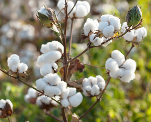
All-natural fibers at the heart of our approach
We are very tuned in to what our global impact as designers is on the environment. All our featured textiles are made from 100% all-natural fibers. We know that we... Read more